
Wopisanje
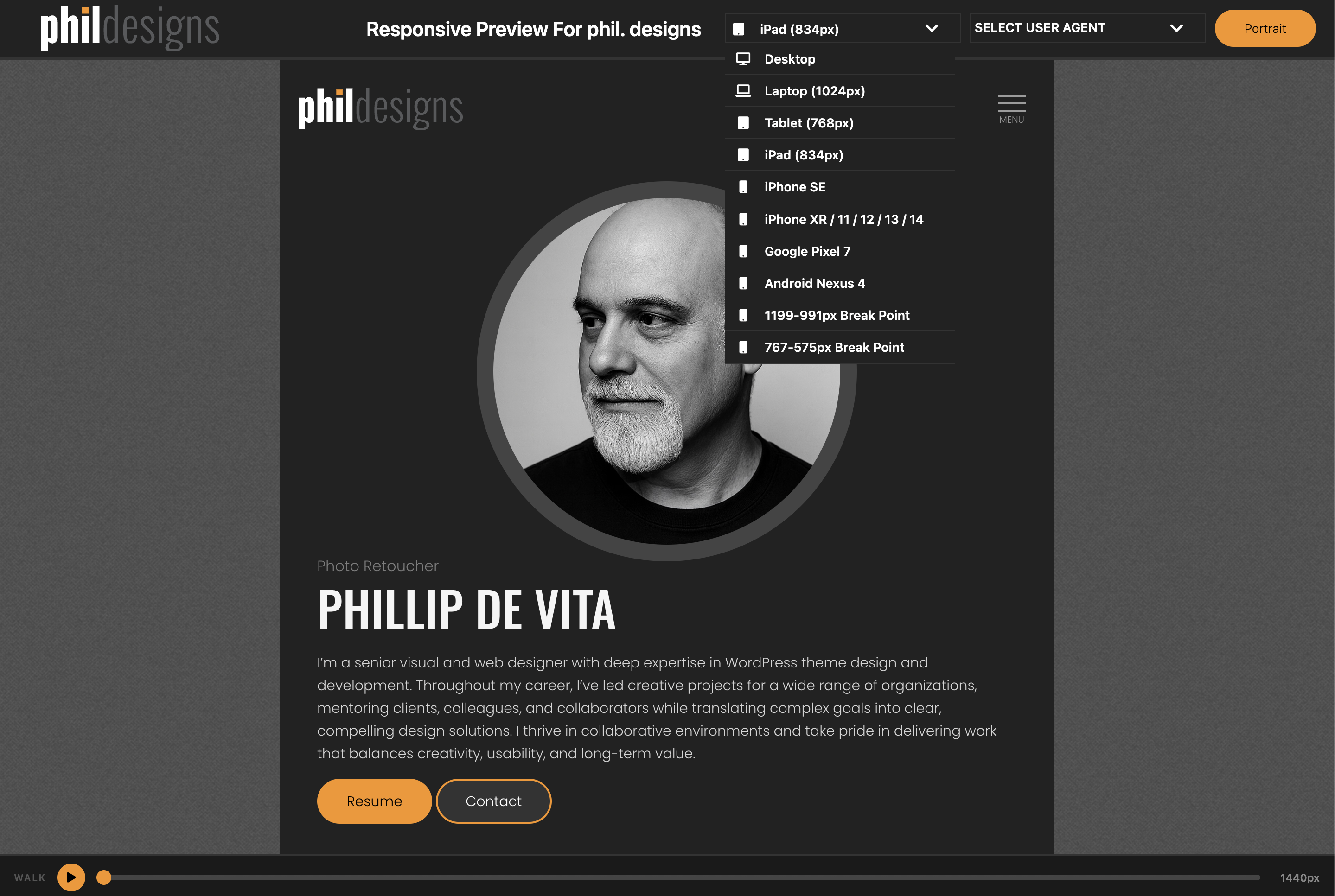
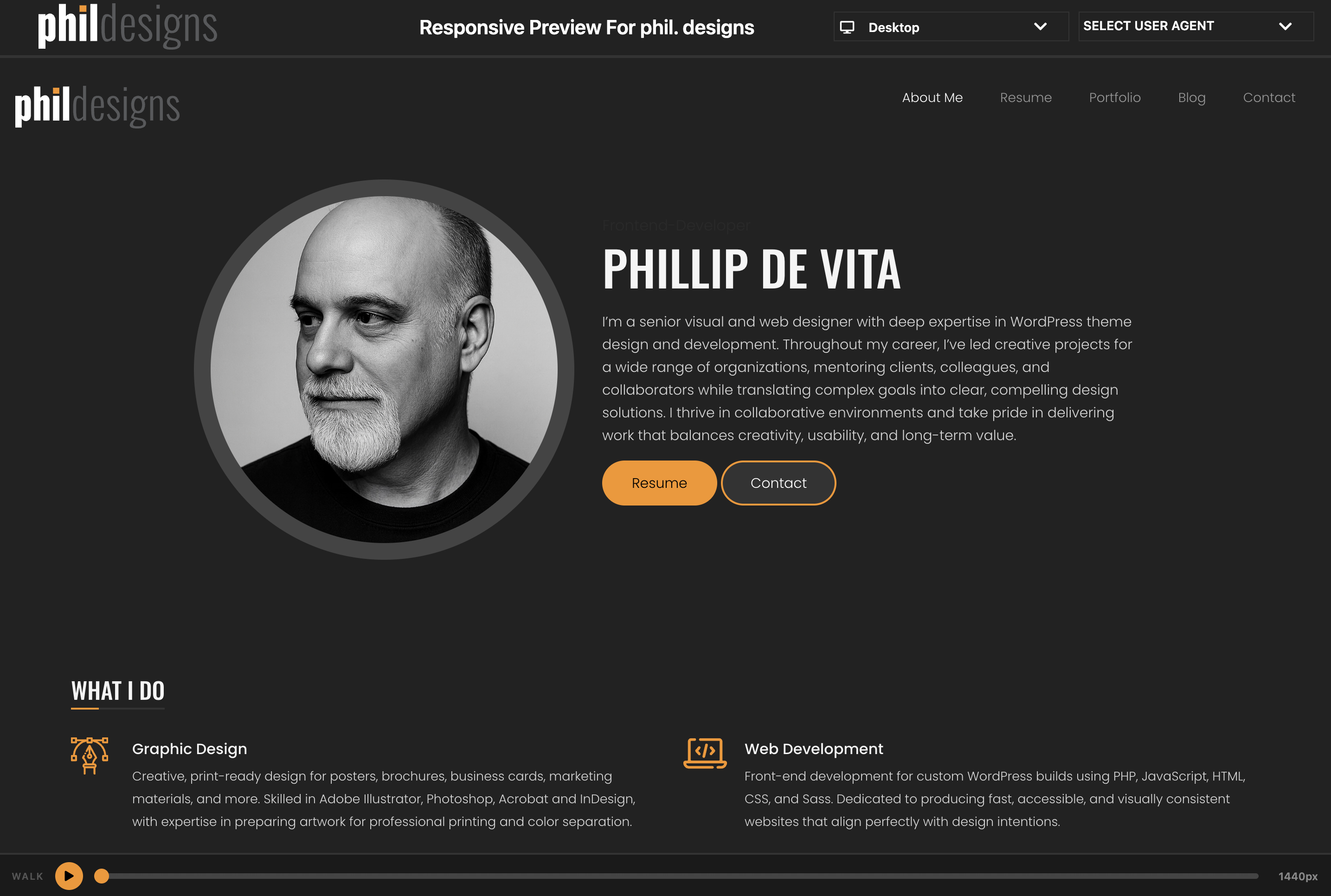
Responsive Preview adds a link to the WordPress admin toolbar that opens your site inside a full-screen preview interface. Switch between device viewport sizes and use the Responsive Walk feature to animate a smooth sweep from 1440px down to 320px.
Features
- Device Viewports — desktop, laptops, iPad, iPhones, Pixel, and more; toggle portrait/landscape on rotatable devices
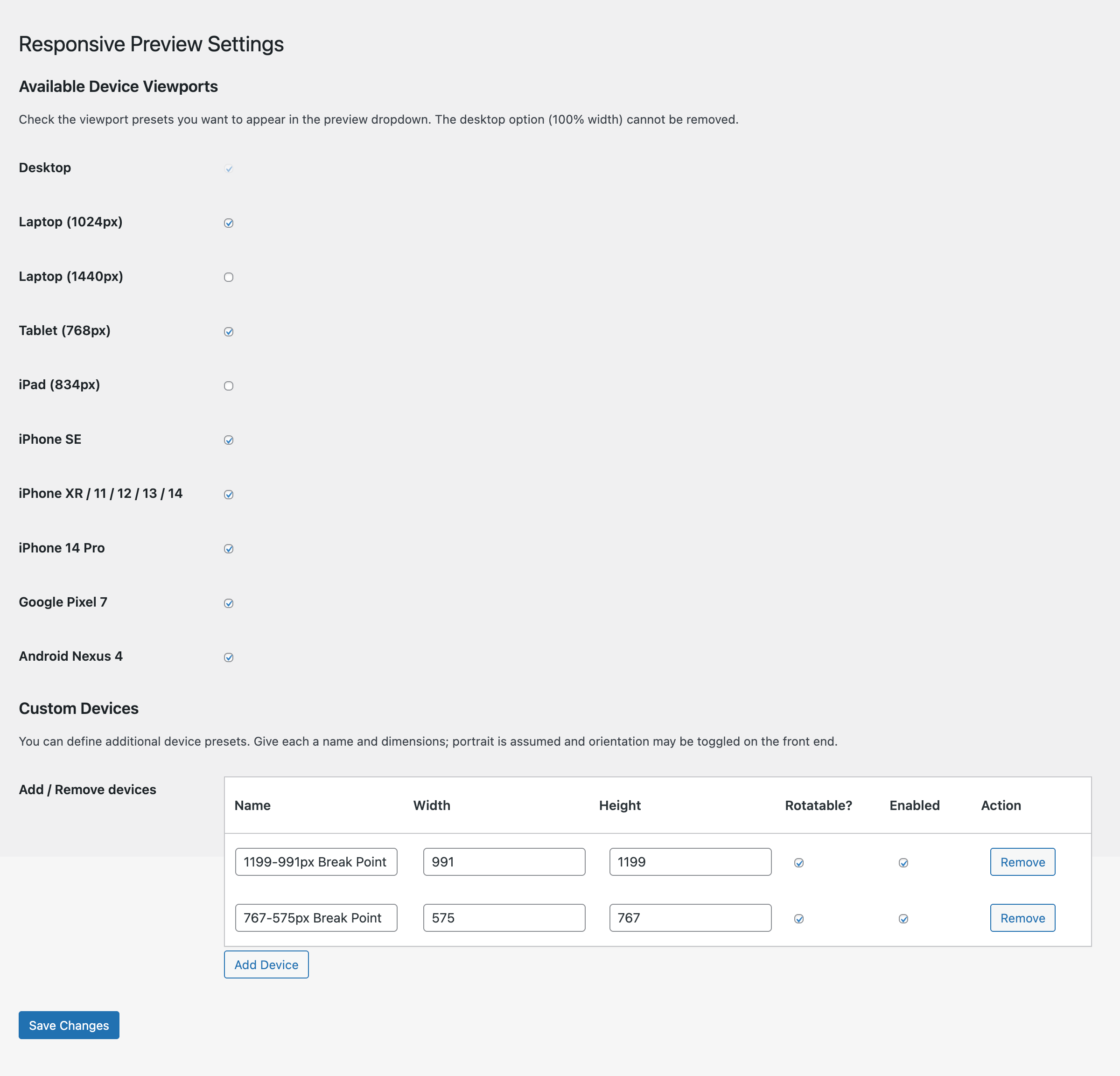
- Custom Devices — define your own device presets with a name, width, and height; manage them from the settings page
- Responsive Walk — play/pause animation that sweeps the iframe from 1440px to 320px over 10 seconds, with a scrubbable progress bar
- Settings page — enable or disable any viewport from the device dropdown
Usage
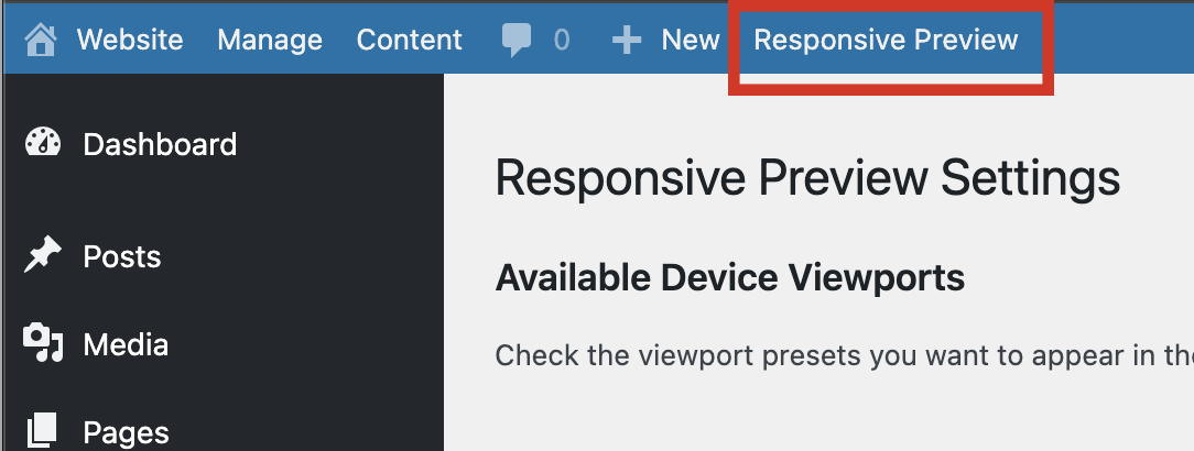
- After activation, click Responsive Preview in the admin toolbar (top bar).
- A new window opens with your site in the preview frame.
- Use the SELECT VIEWPORT dropdown to switch device sizes.
- Click the orange play button at the bottom to start a Responsive Walk.
Fota wobrazowki
Instalacija
- Upload the
responsive-previewfolder to/wp-content/plugins/ - Activate the plugin through the Plugins menu in WordPress
- Click Responsive Preview in the admin toolbar to open the preview
HSP
-
Can I add my own device sizes?
-
Yes. Go to Settings Responsive Preview, scroll to the Custom Devices section, and add as many devices as you like.
-
Why can’t I remove the Desktop viewport?
-
The Desktop option (100% width) is always enabled so there is always at least one viewport available.
Pohódnoćenja
Za tutón tykač pohódnoćenja njejsu.
Sobuskutkowarjo a wuwiwarjo
„PhilDesigns Responsive Preview“ je softwara wotewrjeneho žórła. Slědowacy ludźo su k tutomu tykačej přinošowali.
Sobuskutkowarjo
Přełožće „PhilDesigns Responsive Preview“ do swojeje rěče.
Na wuwiću zajimowany?
Přehladajće kod, hladajće do SVN-repozitorija abo abonujće wuwiwanski protokol přez RSS.
Protokol změnow
3.1.1
- Renamed all remaining
rp_function, option, and settings-API identifiers to thephilrepr_prefix (the shorter prefix was flagged as too short by the plugin review)
3.1.0
- Added Responsive Walk — animated iframe width sweep from 1440px to 320px with scrubbable progress bar
3.0.0
- Switched preview bar to flexbox layout
- Moved orientation toggle out of select box
- Added Settings link on Plugins page
- Added support for enabling/disabling viewports and custom device management
- Updated colours, fonts, and styles
2.0.0
- Added viewport dropdown with popular device sizes
- Added FontAwesome icons
1.0.0
- Initial release